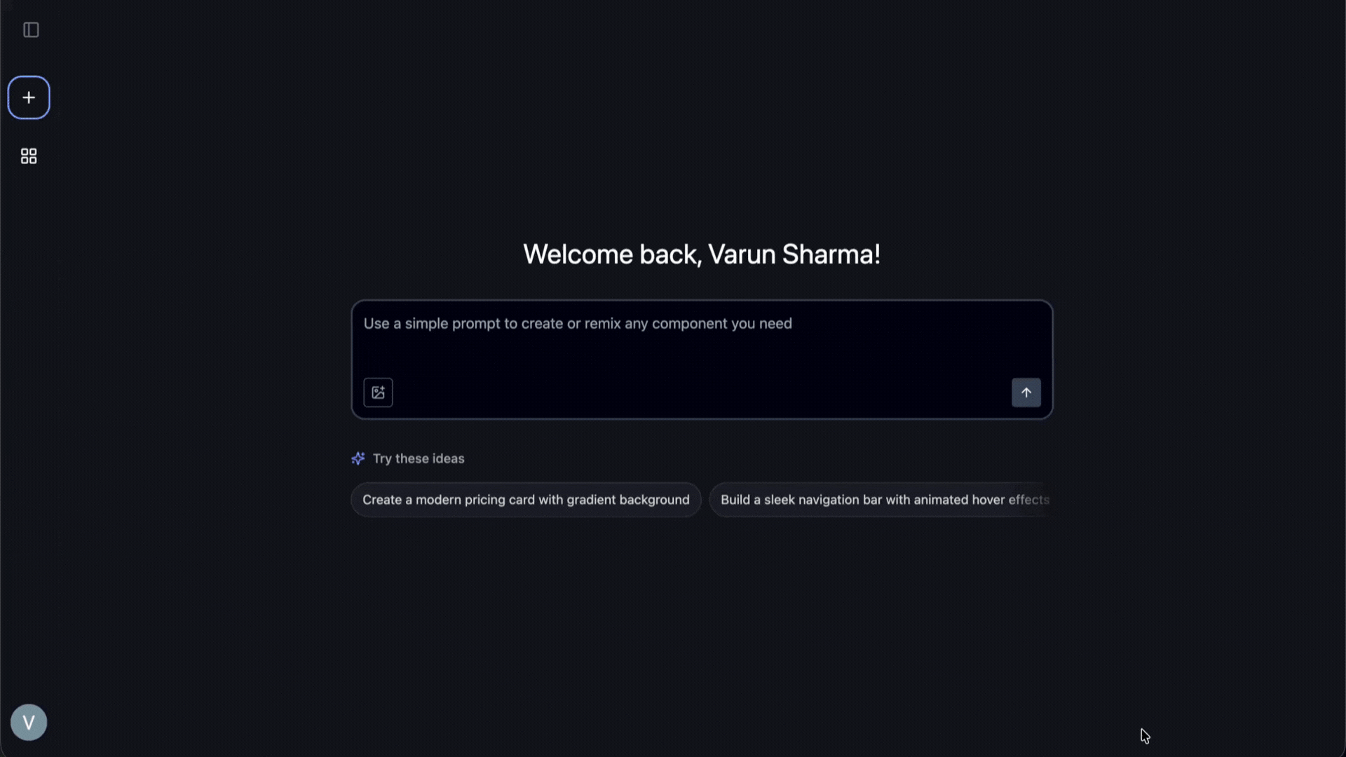
Go from Prompt or Screenshot
to React Component in Seconds.
Supafine is an AI-assisted React UI component builder. Generate or remix components from natural language, stream the code via SSE, and ship faster, no boilerplate.
                                import {'{ Card }'}
                                 from
                                 "./ui/card";

                                export const
                                 MyCard = () => (
                                  <Card
                                 className
                                =
                                "w-full max-w-sm">
                                    <CardHeader>
                                      ...
                                    </CardHeader>
                                  </Card>
                                );
                                _
Image-context generation (NEW)
Upload any UI screenshot. Supafine generates similar, editable React + Tailwind code.
Remix & reuse
Fork public components or duplicate your own without changing the original.
Searchable Library
Public components ranked by views and likes; switch to private mode for your workbench.
Patch Apply (coming soon)
Highlight code → describe a change → get a safe, targeted diff with preview + log.
How it works
1. Describe or upload
Prompt in natural language or upload a UI image for context.
2. Generate & iterate
Code streams in; tweak, regenerate, or fork a template.
3. Reuse & share
Keep private, or publish to the library for likes, views, and forks.
Developer-centric features
Get clean, editable React and Tailwind. No proprietary wrappers, no lock-in.
- Image handling: Upload an image and generate a similar component.
- Public/Private visibility: Public = discoverable & forkable; Private = yours only.
- Homepage discovery: Public components ranked by views and likes.
- Fork & duplicate: Fork public, duplicate your own to explore variants safely.
Patch Apply (In Progress)
Natural-language, targeted diffs. Select code, describe a change, and get a minimal patch.
> Make CTA pill, add icon
<Button variant="outline" className="rounded-md">
+ <Icon className="mr-2 h-4 w-4" />
+ <span className="rounded-full">
  Explore
+ </span>
</Button>
Why use Supafine?
| Feature / Capability | Supafine | Cursor | ChatGPT |
|---|---|---|---|
| Builds app component-by-component | ✅ Yes – focused on modular component generation for better iteration and polish | ⚙️ Partially – helps edit code but not structured for component-by-component generation | ⚙️ Partially – can generate components but not maintain iteration context visually |
| Visual preview & iteration loop | ✅ Built-in preview with live iteration and version history | ⚙️ Requires local dev setup to preview | ✅ Built-in preview |
| No local setup required | ✅ 100% browser-based; start prompting instantly | ❌ Requires local editor and setup | ✅ Web-based |
| Image-to-code generation | ✅ Yes – converts screenshots into pixel-perfect React + Tailwind components | ✅ Supported | ✅ Supported |
| Code ownership & export | ✅ Clean, framework-free React + Tailwind output | ✅ Yes – local codebase | ✅ Yes – copy output manually |
| Natural language iteration | ✅ Persistent conversation tied to each component | ✅ Inline AI edits | ✅ General chat-based edits |
| Version control & revert | ✅ Built-in version history per component | ⚙️ Git integration required | ❌ Manual prompt management |
| Focus | UI component generation & iteration | General-purpose AI IDE | General-purpose AI assistant |
Explore popular components
Sorted by views and likes. Fork any component to start fast.

Frequently asked questions
What code does Supafine generate?
React + Tailwind, designed to be readable and editable. We prioritize clean, non-obfuscated JSX that you can copy, paste, and own.
Can I keep work private?
Yes private components are visible only to you and are never indexed in the public library. Pro plans will support private organization-level libraries.
What’s Patch Apply?
It's a way to make targeted changes to existing code using natural language. Instead of regenerating the whole component, you select a region, describe the change (e.g., "make this button blue"), and Supafine applies a minimal diff. The MVP is rolling out soon.
Does it replace engineers?
No. It’s a tool for engineers. It accelerates iteration and removes the boilerplate of building standard UI, letting you focus on logic, state management, and complex interactions.
Can I bring my design system?
Yes. You can tune prompts to match your existing tokens and component conventions (e.g., "use `bg-primary` for the button"). Deeper, token-aware integrations are planned.